website design

New website on the way

By |2017-03-13T11:46:49+00:00April 8th, 2015|Categories: News|Tags: , , , , , |

newwebsite

The website has been due a redesign for quite some time now, but the problem has always been finding a new design that met all the requirements.

Just recently i found the perfect theme to help address a few issues that were becoming more noticeable as time went on. The biggest of these was the fact that the current site is not responsive and mobile friendly, which the new site most certainly will be.  Also the theme’s developer has abandoned any support of the theme which has caused some problems over the last couple of years.

Work will start on the redesign of the website towards the end of this month and will carry on into May with the website being unavailable for around a week to ten days. A few new sections are planned and other areas will be expanded. More news soon.

Client Website Launch

By |2022-10-13T11:02:37+01:00March 3rd, 2013|Categories: News|Tags: , , , , , , , , |

wendy_t_website

Friday morning saw the launch of the Wendy Tea website – a site featuring glass artwork photography by Richard Flint Photography…. but there’s more!

The website itself was also developed and constructed by Richard Flint Photography in a package that delivered both the photography and the website to the client.

The website description on the website design page nicely sums up the client requirements :-

The Wendy Tea site uses audio, video and photography with additional features including a book format journal, social media integration, photo gallery and artwork sales pages to provide the artist with a stylish and artistic presence online. Created to promote and sell glass artwork, the website will also allow the artist to express creative ideas and artistic concepts.

The Wendy Tea website can be found at www.wendytea.co.uk

Responsive Website

By |2017-03-13T11:46:51+00:00March 7th, 2012|Categories: News|Tags: , , , |

New developments are on the way that should improve the website viewing experience for tablet computer/smart phone users.

The website has been using the Onswipe service to make the viewing experience for iPad and Android tablet users much better, however i wasn’t happy with the layout or the user functionality that Onswipe provided. It didn’t really suit the website.

Plans are under way to make the website design responsive. That means that the site design will respond and adapt its layout to the device you are using. So far the results look impressive, giving a great viewing experience to iPad and mobile phone users.

The responsive design should go live within the next few weeks.

SlideShowPro Progress

By |2017-03-13T11:46:51+00:00February 2nd, 2012|Categories: News|Tags: , , , , |

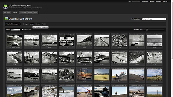
Editing the photo galleries in SlideShowPro

January saw the completion of the SlideShowPro gallery conversion process. All of the galleries are now powered using the excellent application’s media player and offer full screen viewing. You can view my review of SlideShowPro Director here.

Several of the galleries remain on the website but are not listed in the portfolio area. These second layer galleries can be accessed typing the word ‘portfolio’ into the website search box. This seemed to be a better solution than totally deleting the work from the site.

The galleries in line for further development are the portrait, single images and Norfolk project sections. More work will be added to these slideshows over the coming weeks.

The website has been getting some great feedback with clients and visitors impressed by the design and ease of use. One web designer even commented that ‘this is the way all photographers should have their website’.

The work continues! Refinements to text, layout and navigation are just some of the improvements made over the last few weeks, with more changes to come this month.

Finally, don’t forget to check out the new Tumblr blog 50mm for daily photo posts. All sorts of images, news and photography miscellanea posted there.

Title

Go to Top